Coupon Purchase Flow Redesign

Gorod is a cashback and loyalty app of Russia’s Troika transport system. While topping up cards worked well, the coupon section was underused. I redesigned the coupon flow to boost user engagement and revenue.

Role

Sole Mobile App Designer

Team

Product Manager, Head of Product, Web Designer

Timeline

2022 Q3 — 2023 Q2

About the challenge

Problem

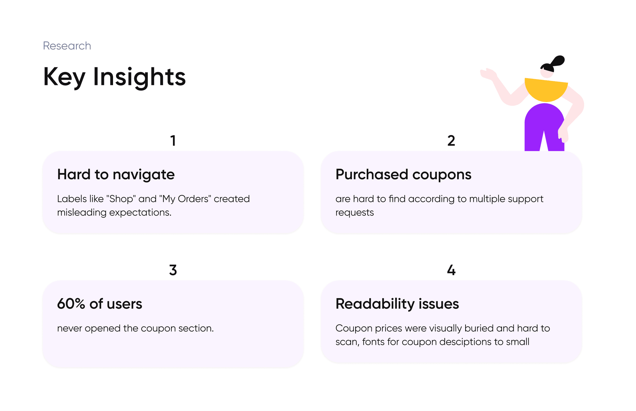
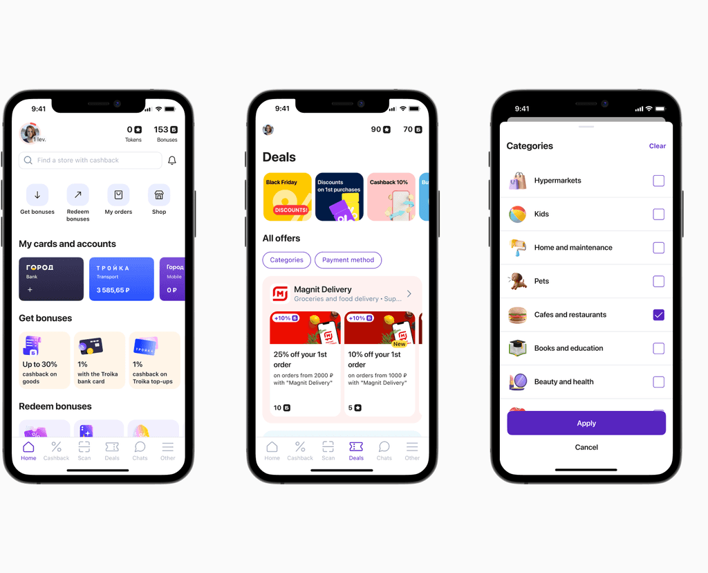
Most users viewed Gorod as a simple transport top-up app. Very few explored or bought coupons, which were key to boosting revenue and app stickiness. The existing coupon flow was outdated, confusing, and hidden under a "Shop" section — causing frustration, low engagement, and missed monetization opportunities.

Goal

Make Gorod a daily utility app by increasing coupon purchases and revenue, improving retention, and reducing churn.

Scope

Full redesign of the coupon purchase flow — from navigation to post-purchase experience.

Discovery & research

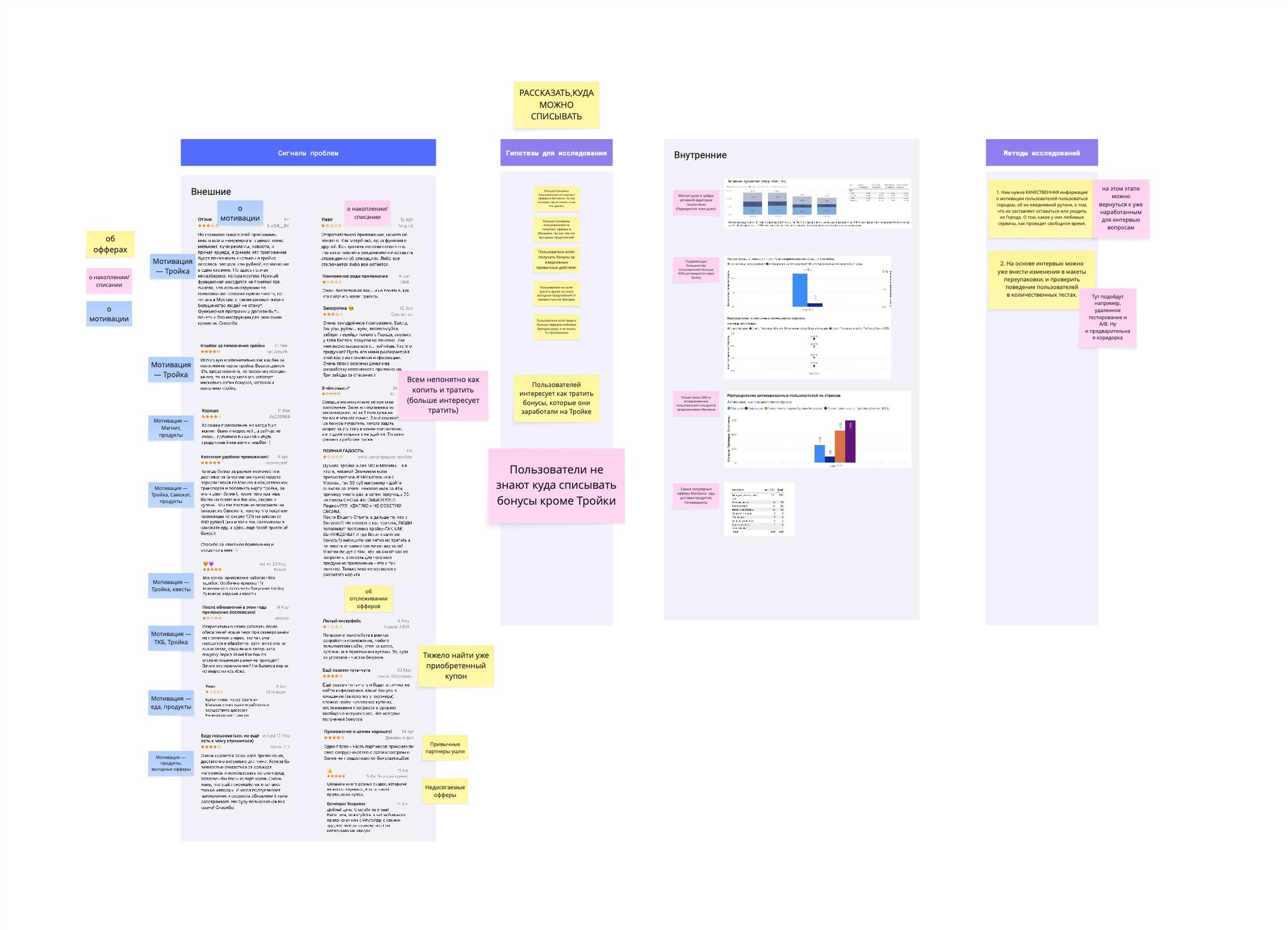
I partnered with the PMs and analytics team to investigate the coupon usage. I began with a UX audit of the existing coupon purchase flow, then expanded the research by studying internal data, reviewing user feedback from app reviews, and conducting informal hallway testing sessions. I also spoke with stakeholders from marketing, support, and sales to capture a cross-functional view of the problem.
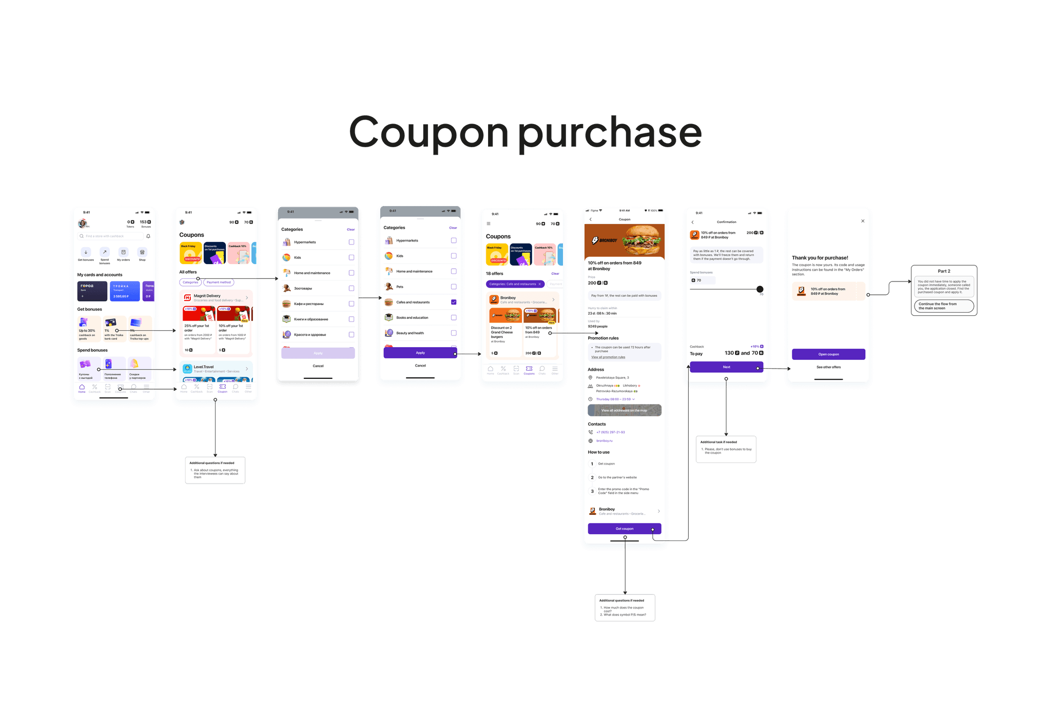
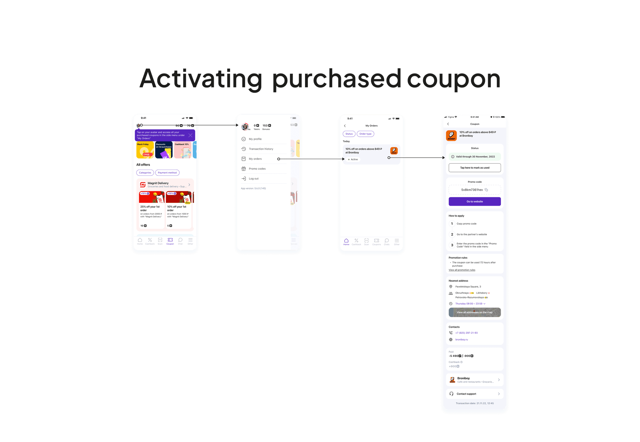
Design process

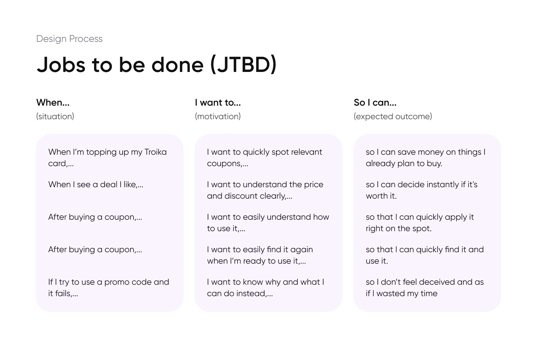
In collaboration with the team, I created JTBDs based on user needs. This helped us reframe the design challenges from a user goal perspective and map an improved end-to-end flow for coupon purchase.

First iteration

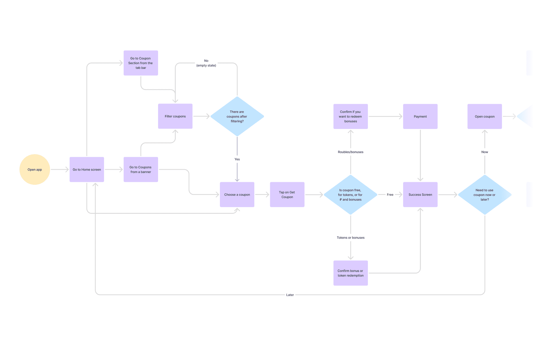
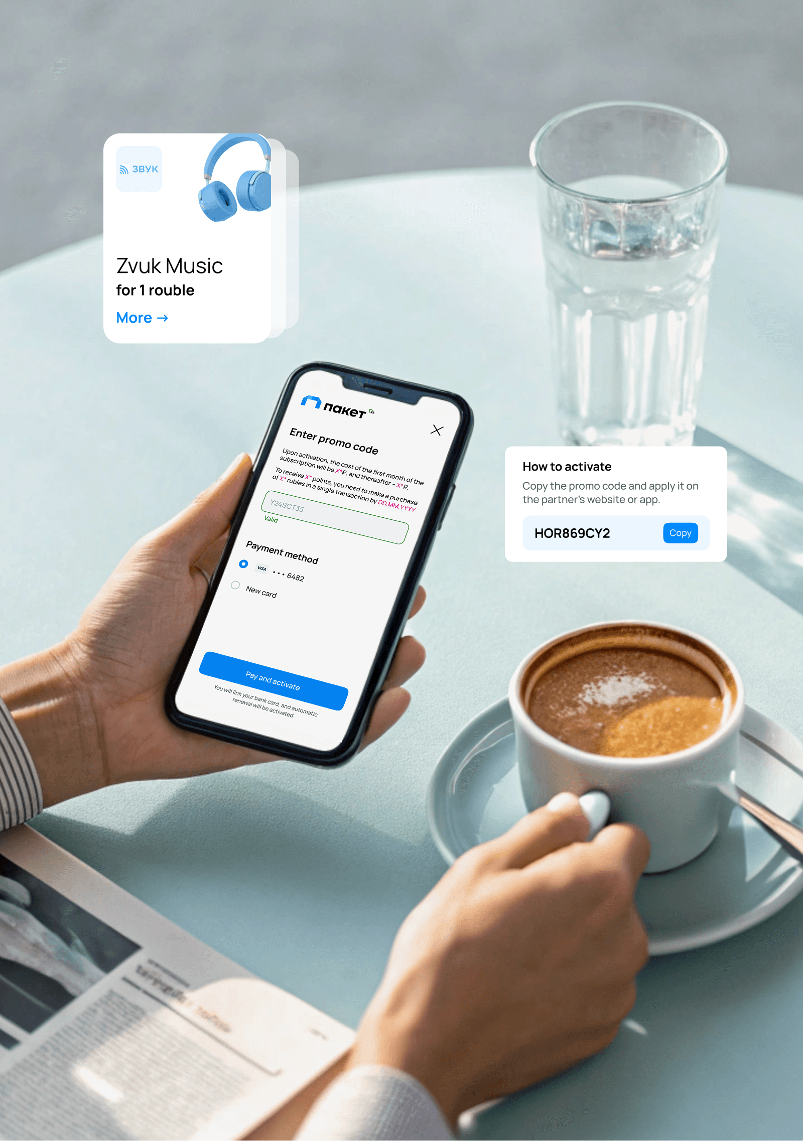
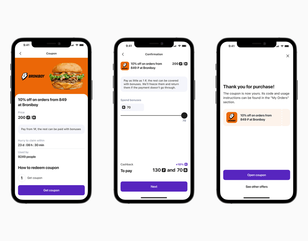
Through iterative wireframing and close collaboration with stakeholders, I designed the first version of the flow using the design system and custom components I had created.

First iteration

Problem

Solution

Impact

Coupons and deals hidden in the Shop section

Added clear Deals entry point in tab bar, and also banner entry point in the main screen

Improved navigation and deals discovery

Tiny coupon prices and small text

Redesigned coupon cards: bigger prices, better hierarchy, readable fonts

Increased purchases, higher coupon engagement

Confusing category browsing

Added icons to categories

Faster navigation, reduced bounce rate

No easy access to coupons after purchase

Added pop-up indicating where received deals can be found

Reduced user confusion, fewer support requests

No way to mark used coupons

Introduced "Mark as used" feature

Improved UX

Post-purchase confusion

Added clear usage instructions after purchase

Smoother user journey

The "Shop" section was hiding Deals, so I brought them into the front by adding entry points in the tab bar and the home screen in the main dashboard. Coupon cards were redesigned to highlight pricing and improve readability. To ensure users could find their purchases, I added a pop-up guiding them to the 'My Coupons' section after checkout. Also, I introduced a 'Mark as used' toggle to help users manage their coupons and added icons to categories for quicker scanning. Clear instructions were added after purchase to guide redemption, creating a smoother user experience.

Validation

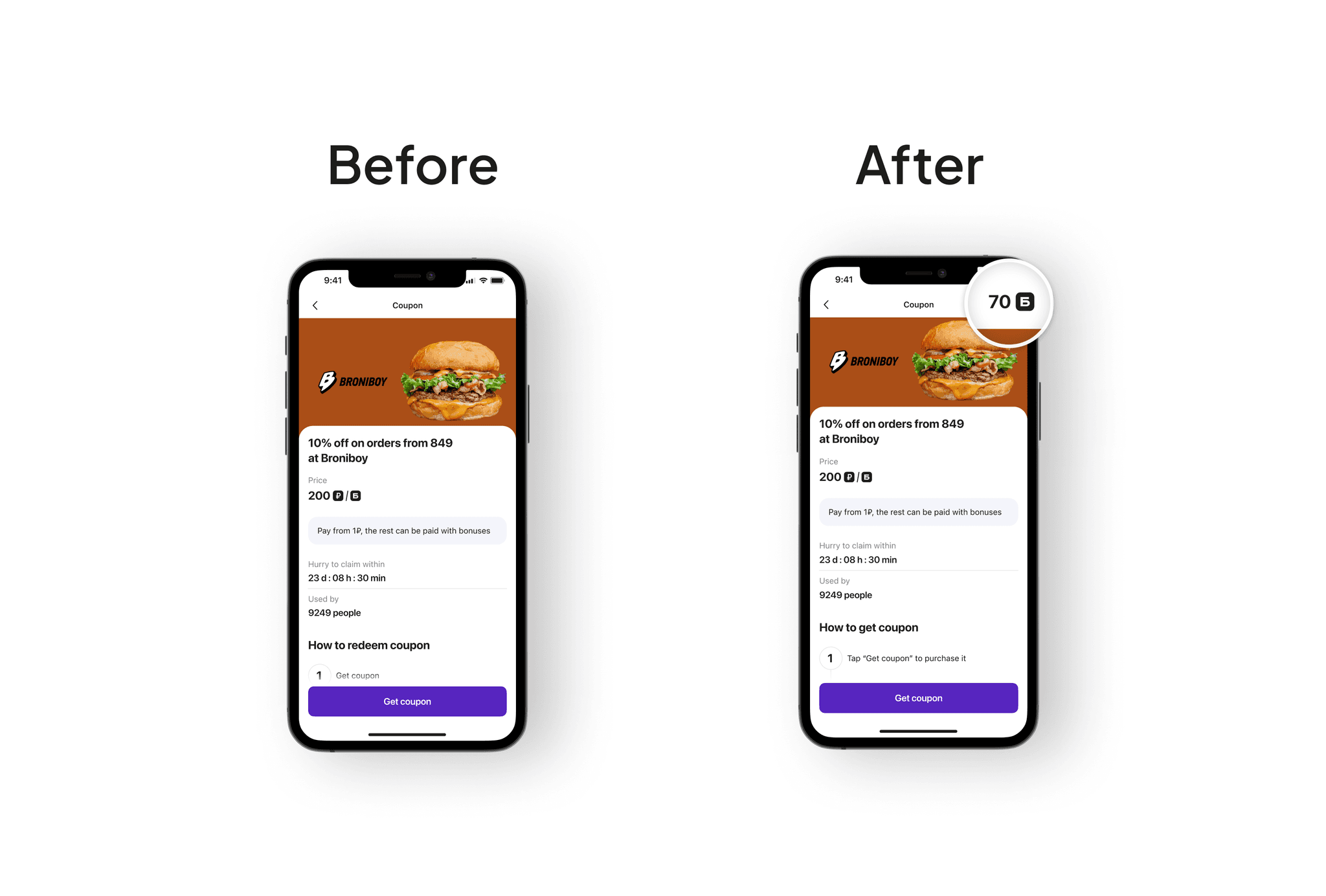
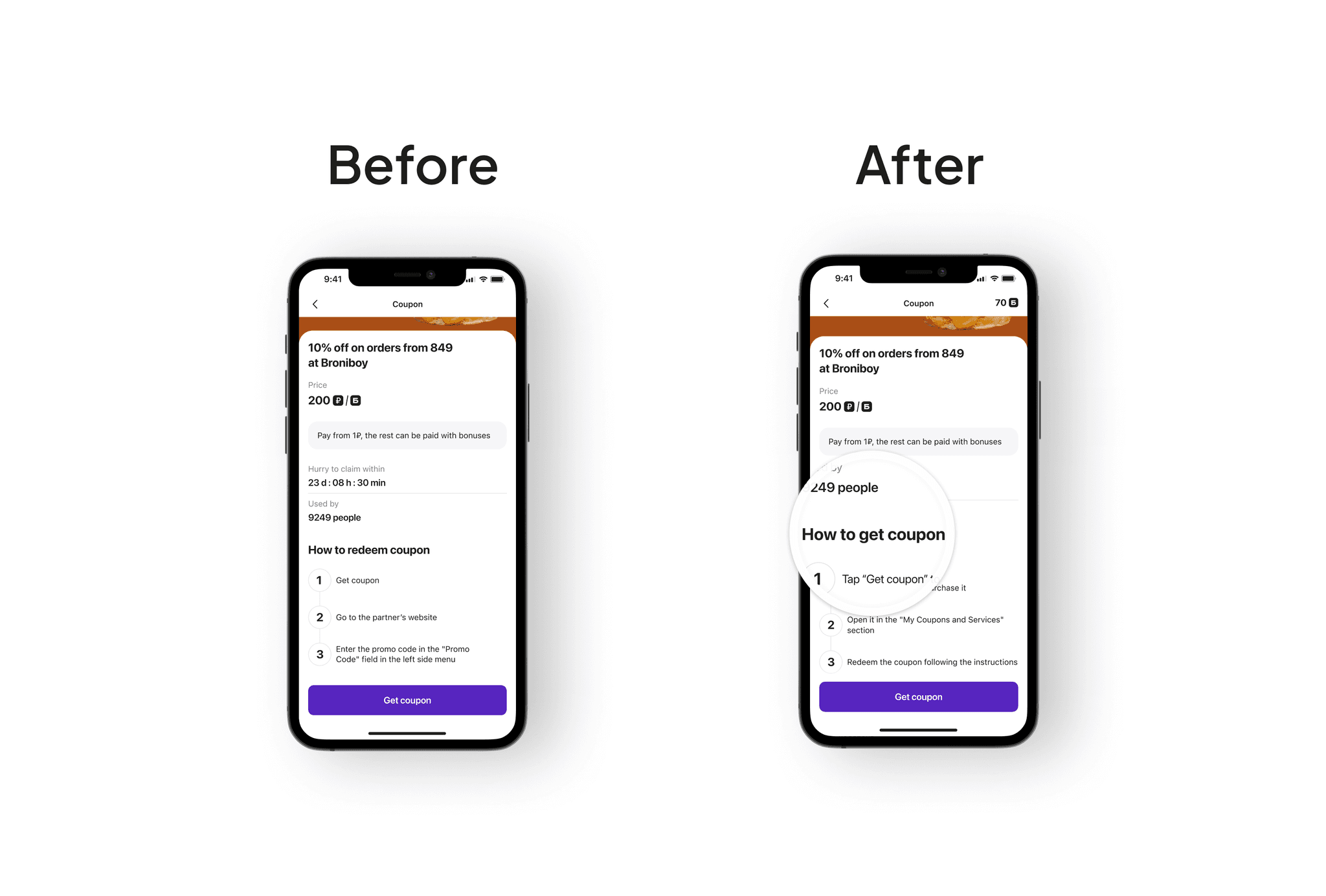
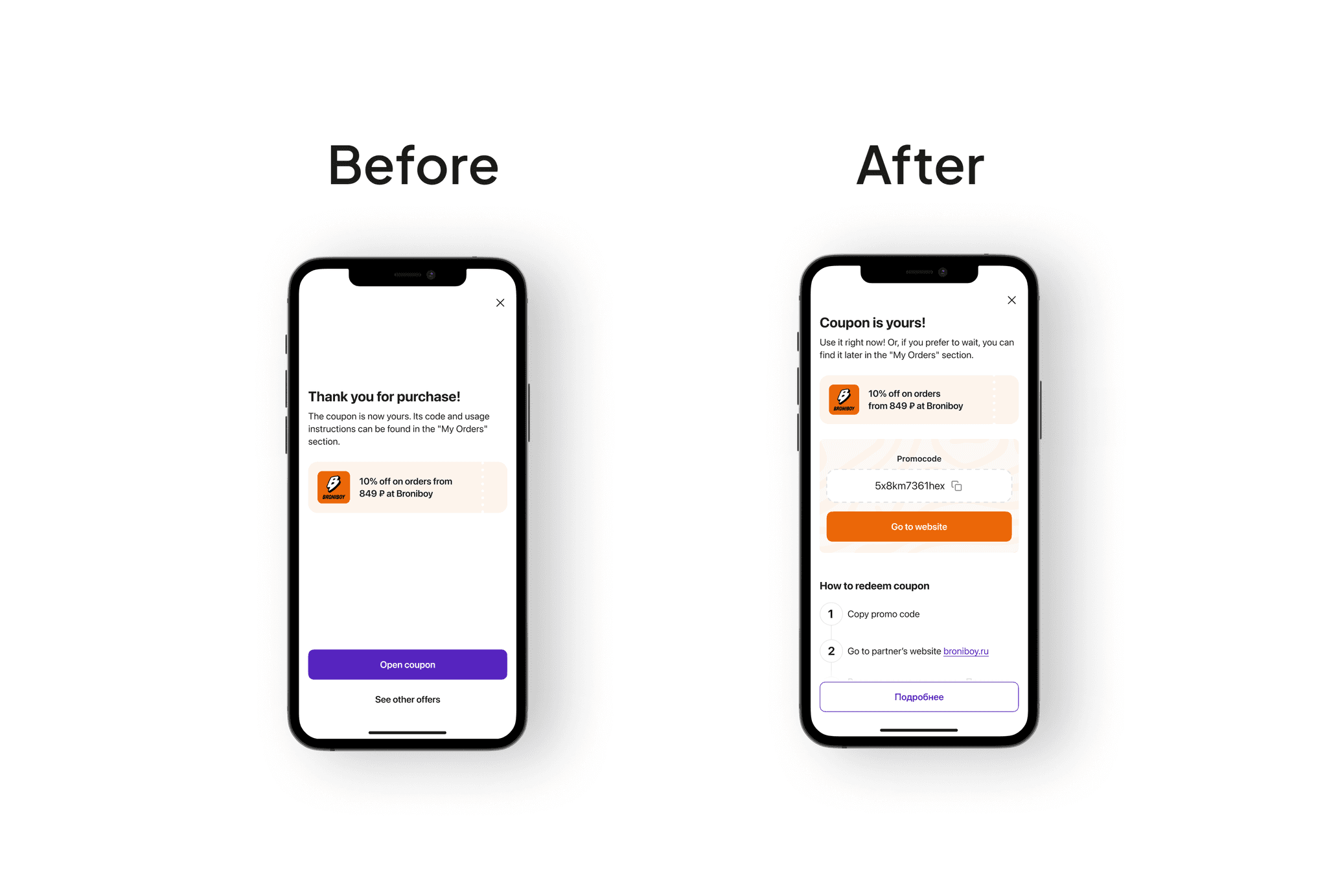
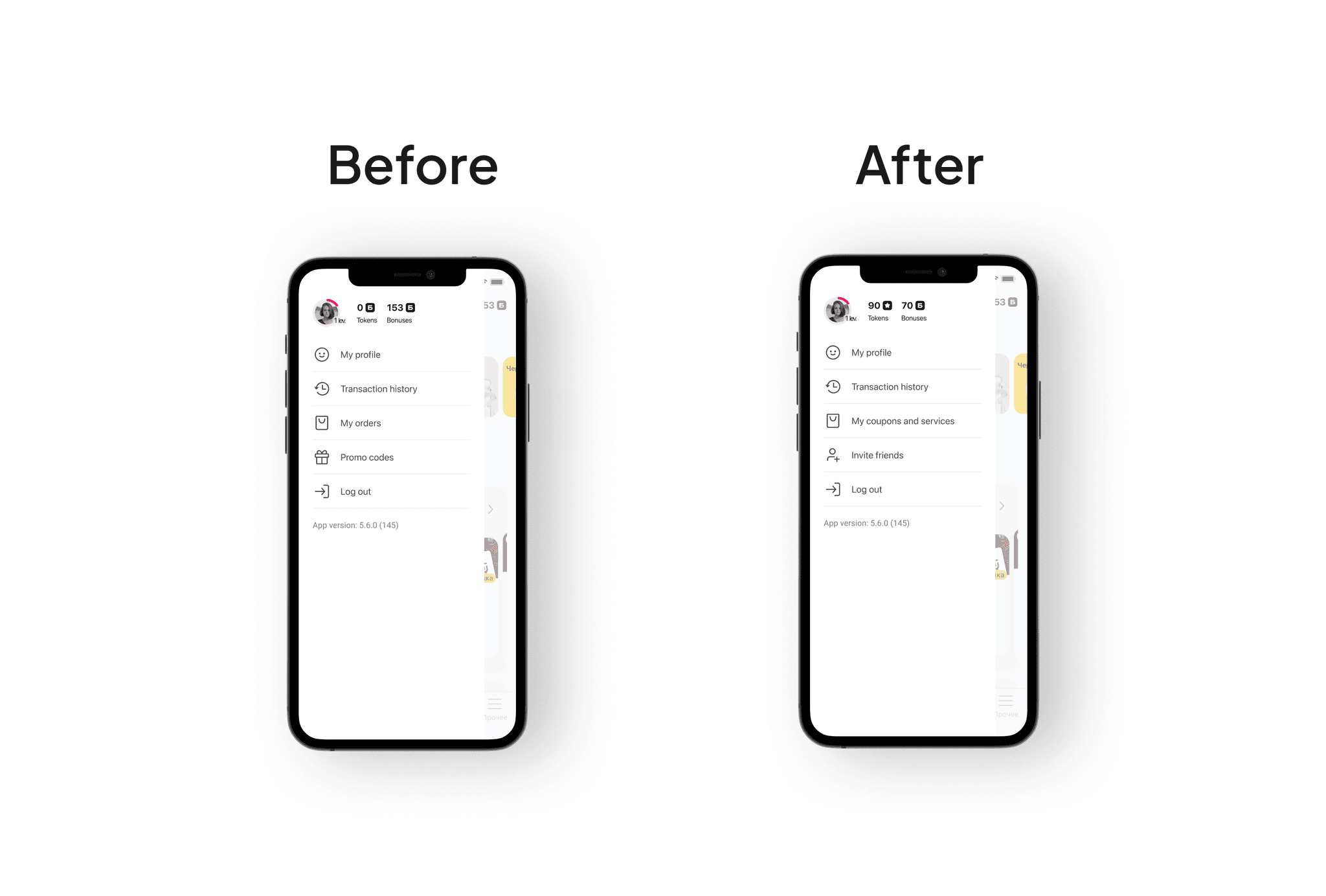
After completing the first prototype, I organized user interviews to validate the flow. Here’s what changed after testing:

  • Bonus balance was added to the coupon page for better visibility.

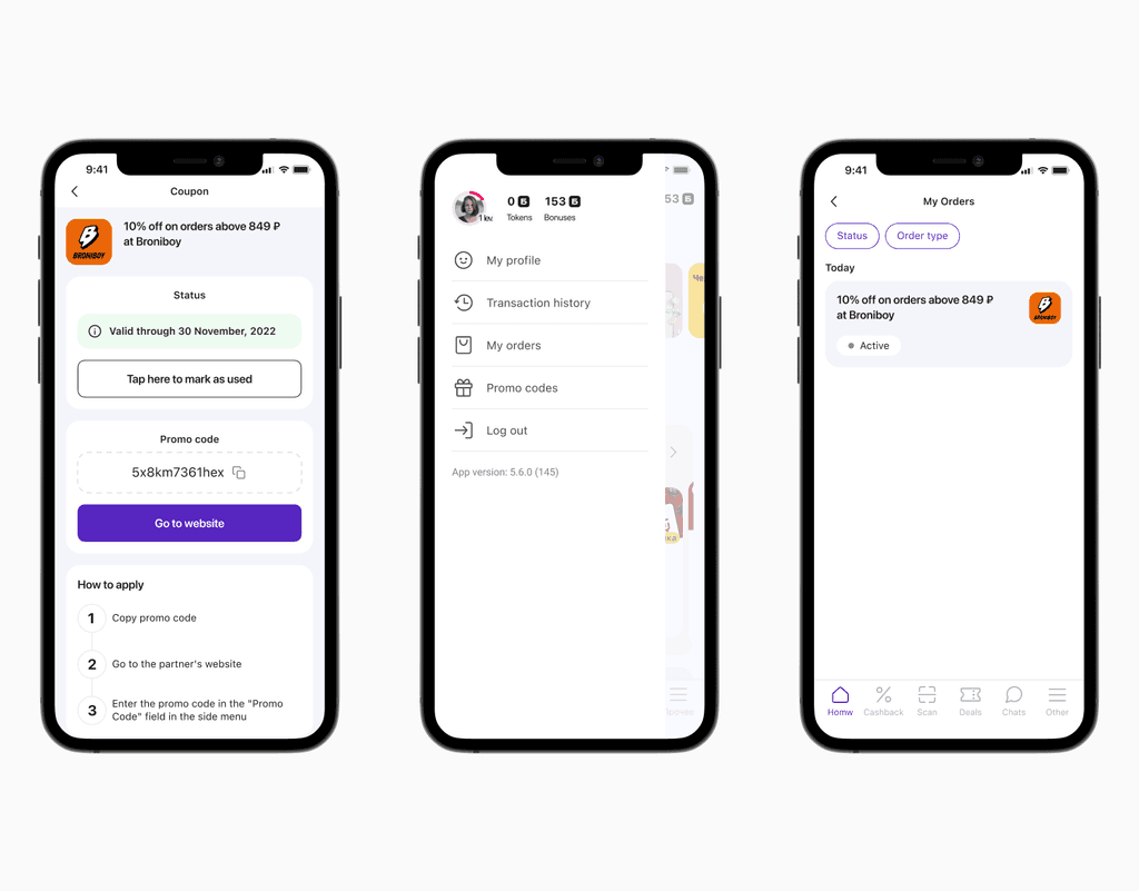
  • Instruction improved: Reframed to "How to get the coupon" instead of only "How to use it".

  • Thank-you page enhanced with immediate, actionable information.

  • Renamed menu sections: "Promocodes" ➞ "Invite a Friend" "My Orders" ➞ "My Coupons and Services".

Flows tested are presented below:

Final design changes

Results & impact

Simplifying the flow and aligning it with user expectations led to improved user engagement with coupons and a revenue uplift.

+ 18.3%

ARPU growth in the first month post-release.

+ 7%

ARPU growth in the second month.

What I learned

This project reminded me that clarity in high-intent flows has exponential impact. When people are ready to buy or redeem, every tap matters. What seems like a "small fix" (a renamed button or visible bonus balance) can unlock massive business value.

It also reinforced how powerful a simple, behavior-driven process can be. Instead of chasing polish early, we stayed lean and tested what mattered. From insight to impact, every step was intentional.

Create a free website with Framer, the website builder loved by startups, designers and agencies.