About the challenge
Too many users were dropping off at checkout or contacting support due to unclear promo code errors and invisible payment source — even if a card was already linked.
Improve clarity and confidence at checkout by redesigning the flow for promo codes, payment previews, and error handling.
UX flow audit and redesign of the promo code and payment step during checkout.
Discovery & research
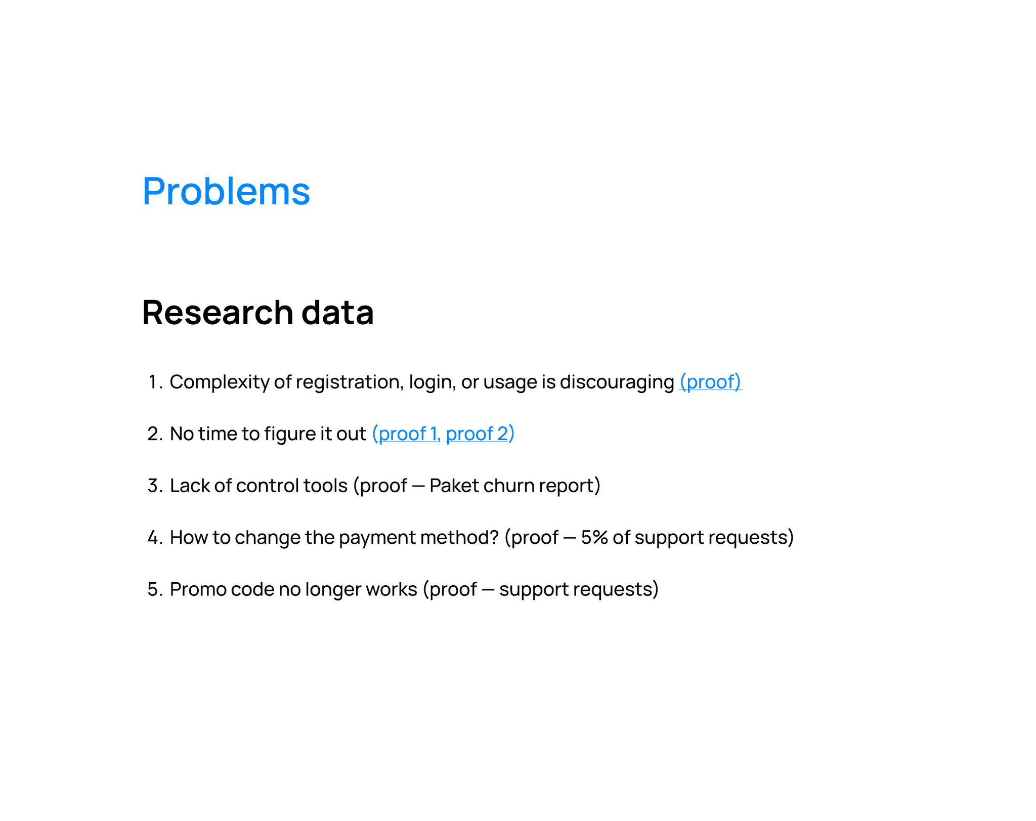
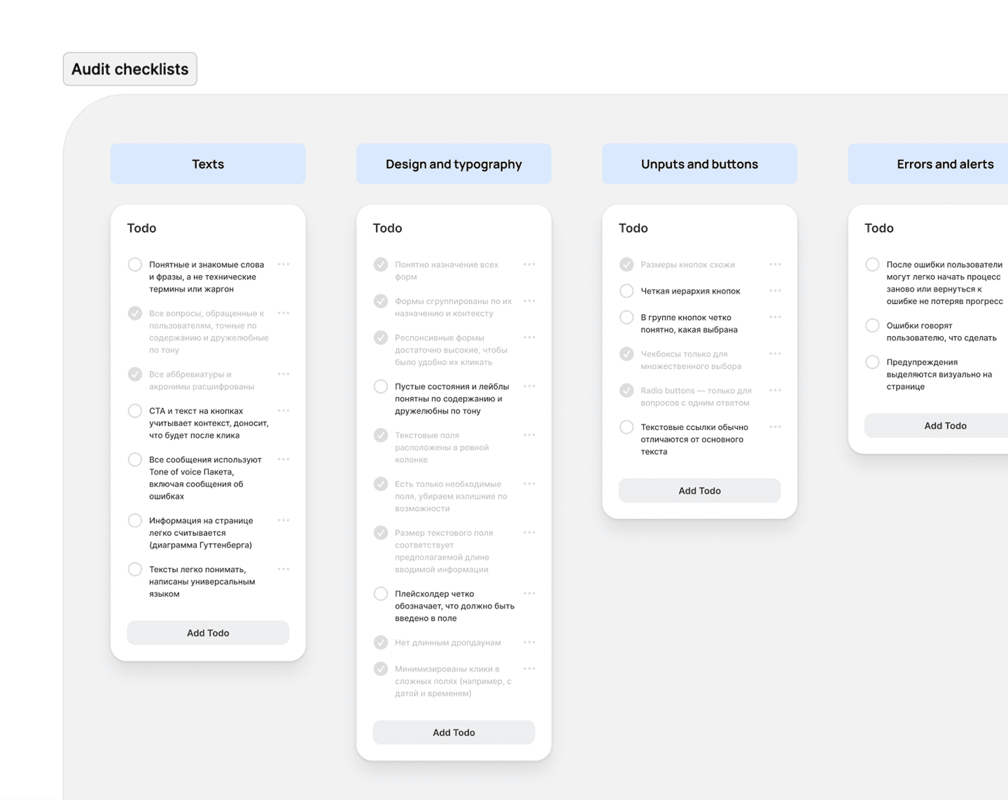
The first step was to analyze the existing checkout flow and uncover key friction points. I conducted a UX audit and combined it with insights from support ticket reviews, internal research data, and a hallway testing. This design-focused analysis helped frame the problem clearly and align the team around our priorities.
Design process
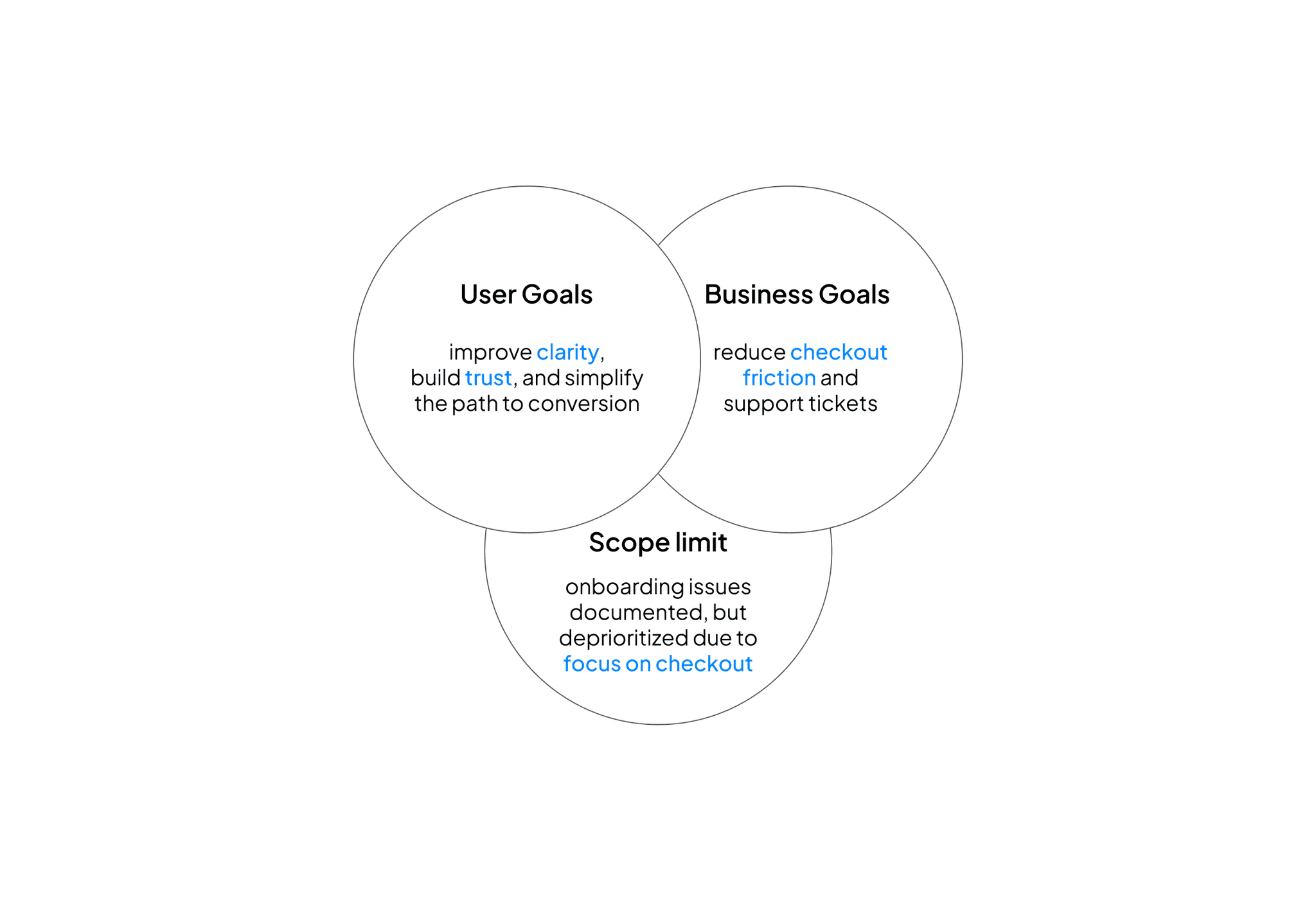
After conducting research I aligned with PM, support, and engineering on the scope, business and user goals
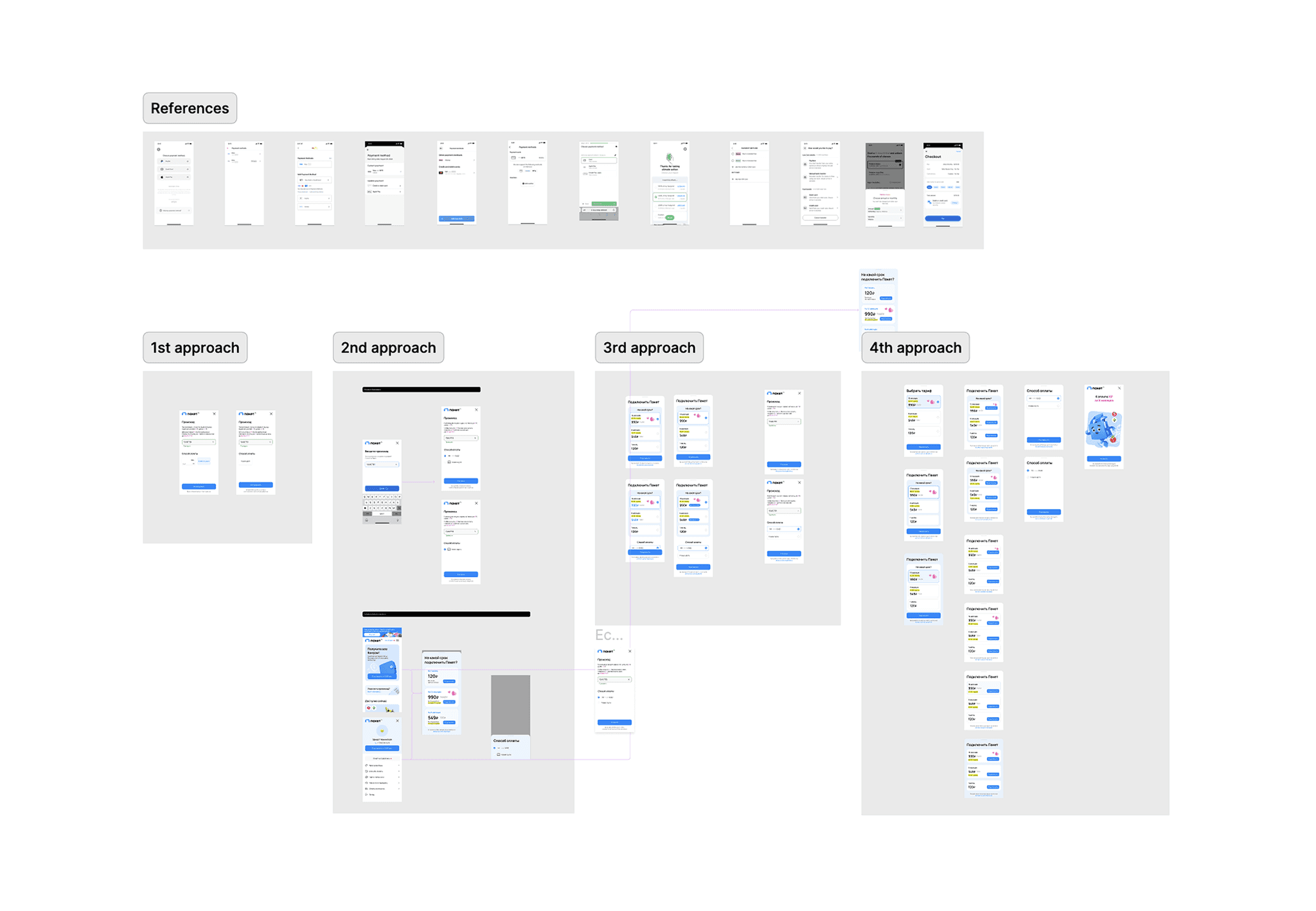
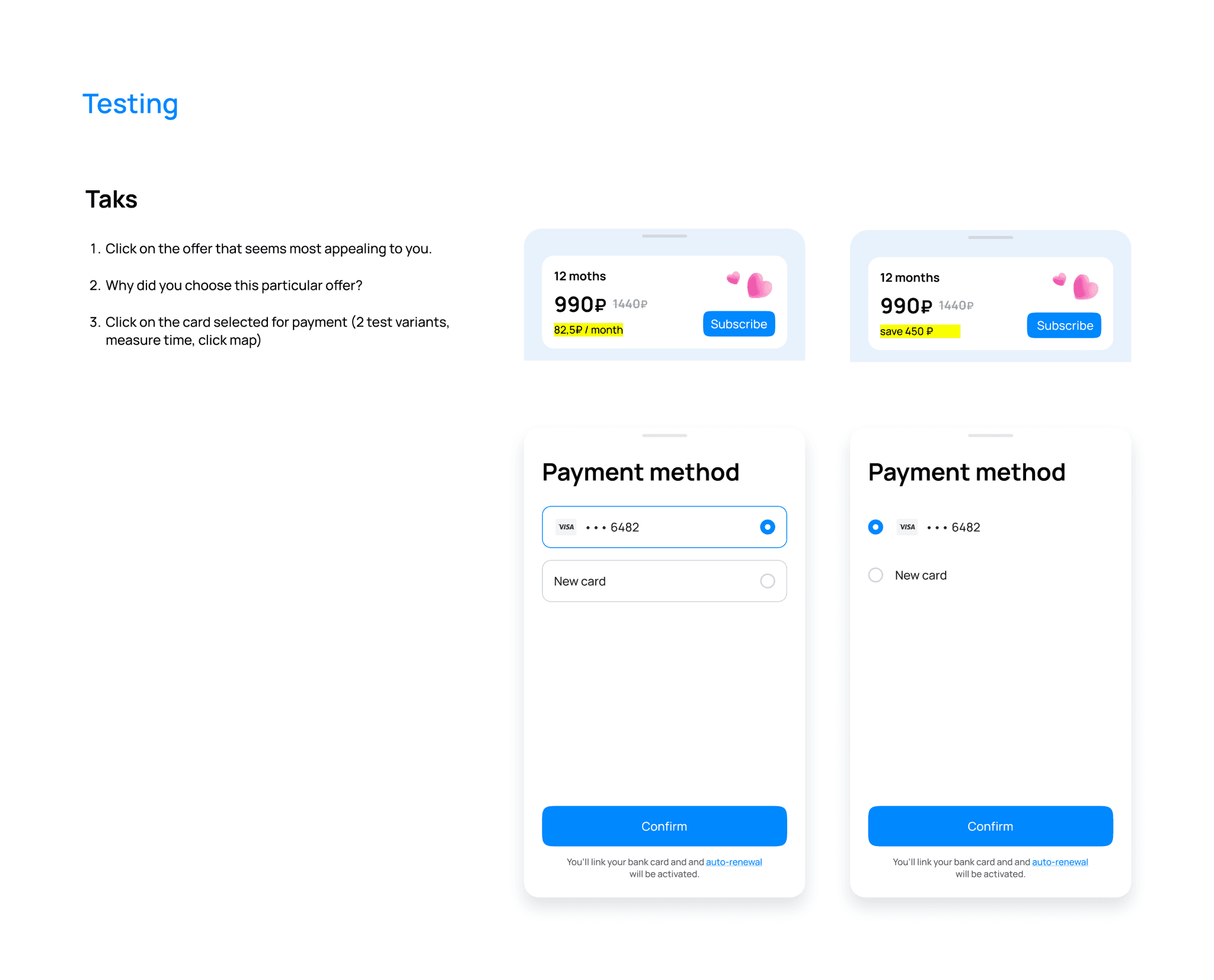
Then I explored different design approaches, conducted a couple of quick unmoderated test through a Fast Tuna for some design decisions, and then the optimal options were selected
Then I explored 4 different design approaches, conducted a couple of quick unmoderated test through a Fast Tuna for some design decisions, and then the optimal option was selected.
Key UX changes
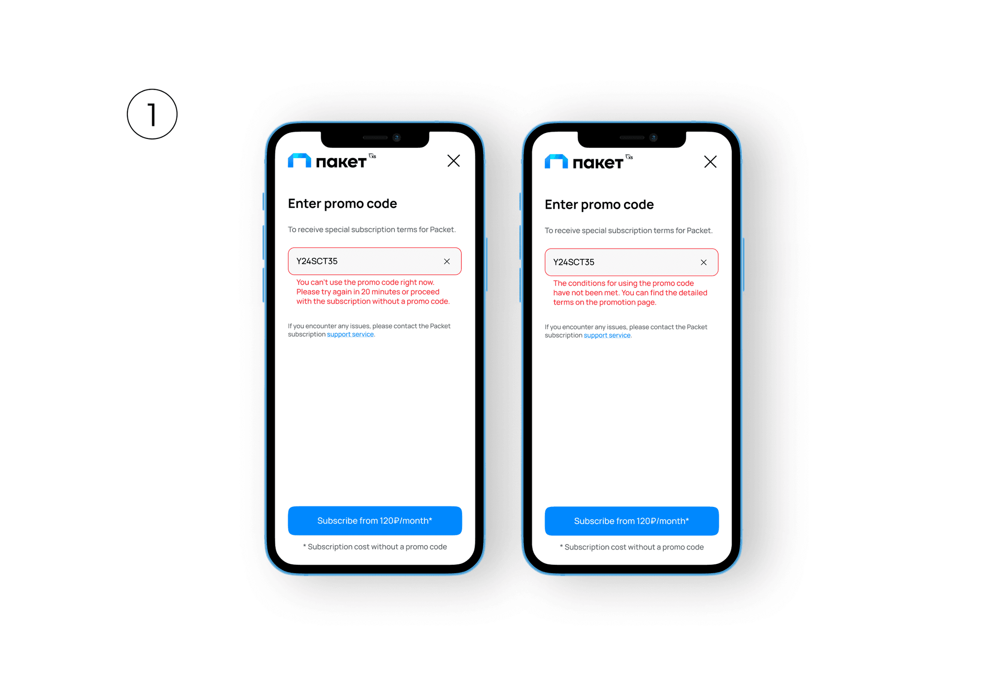
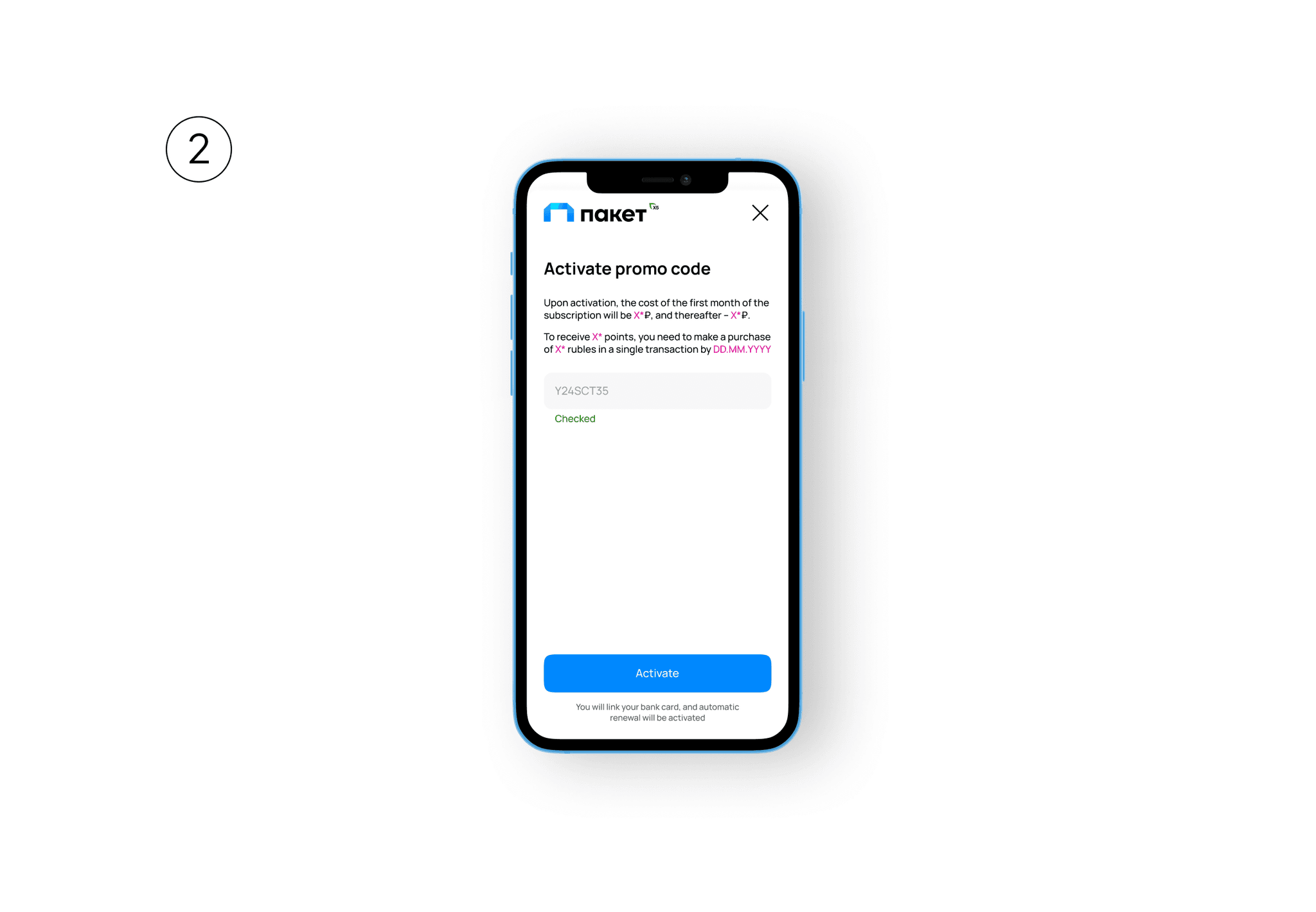
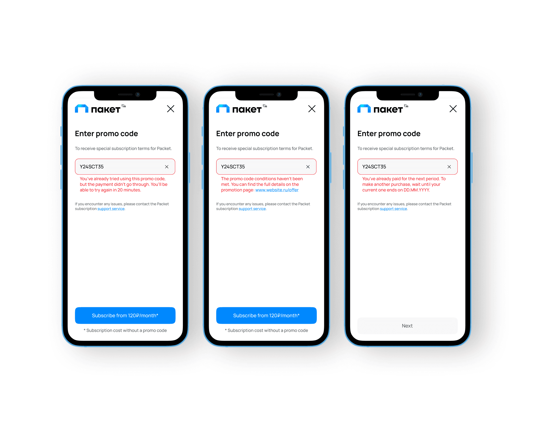
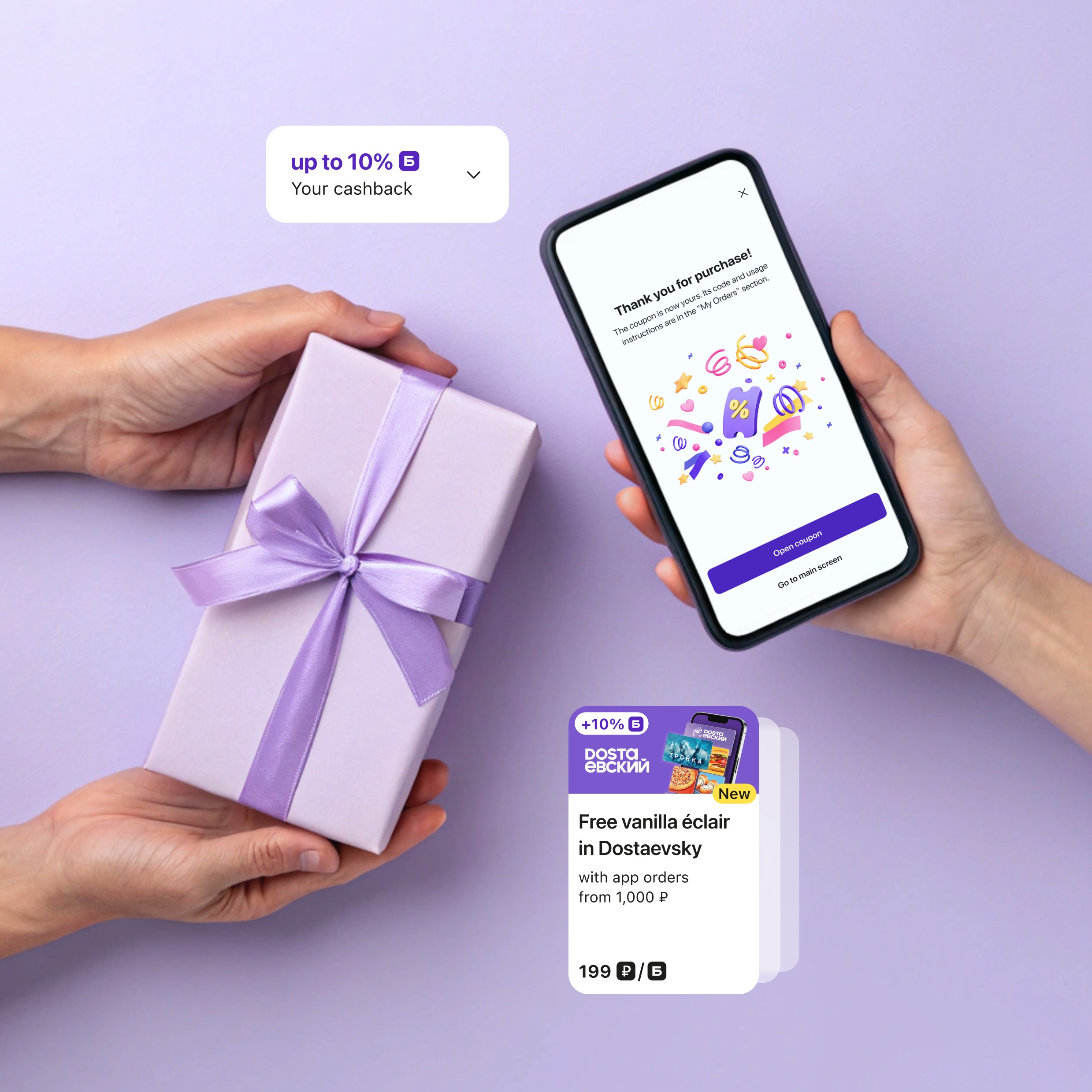
Clarified error messaging: Users were confused by vague promo code errors like “Conditions not met.” I rewrote these messages to be more specific and actionable, including direct links to valid promo terms. This helped reduce frustration and support queries.
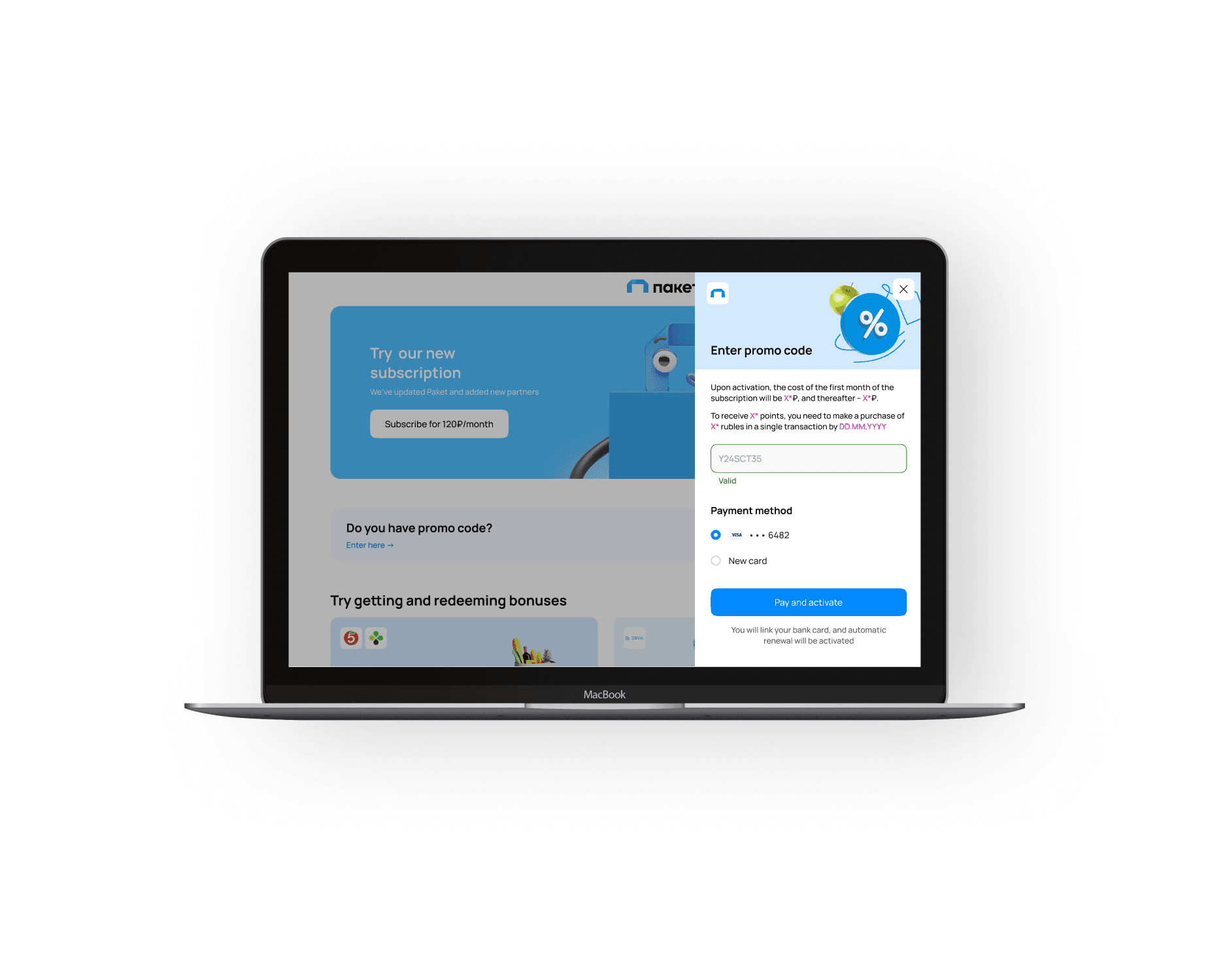
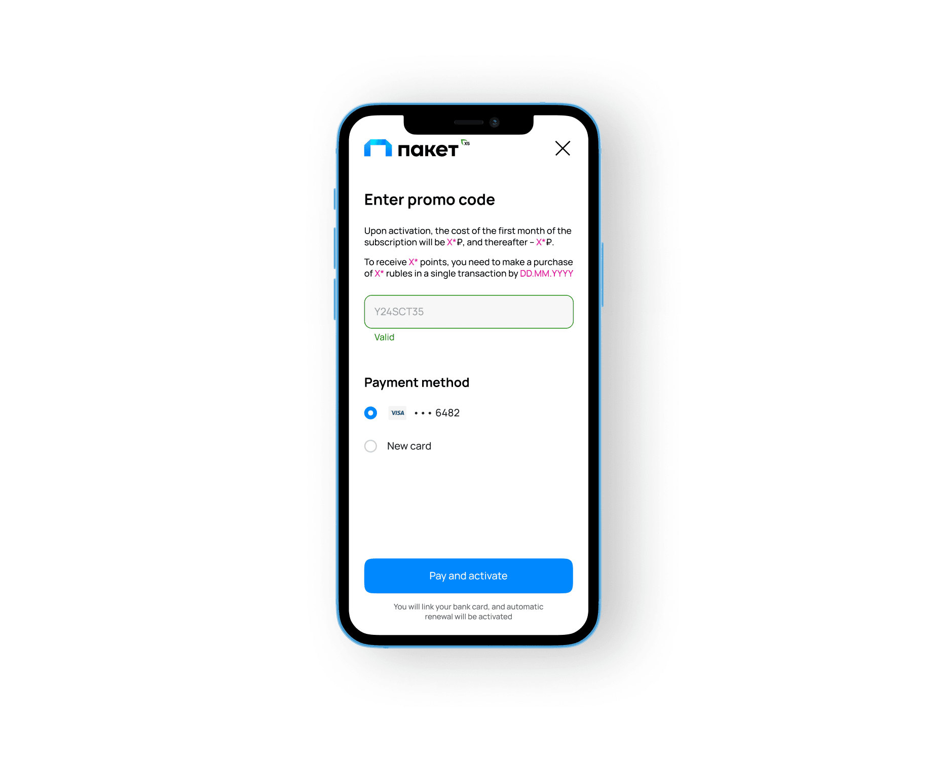
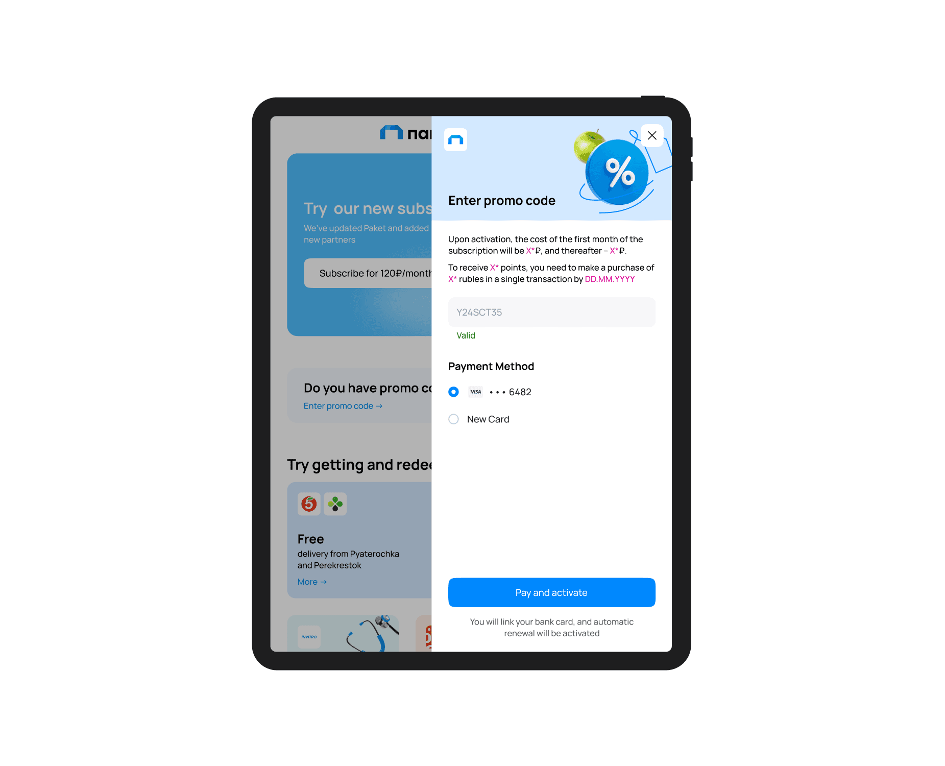
Improved payment transparency: Previously, churn users couldn’t see which card would be charged, leading to hesitation. I added a clear preview step showing the selected payment method before confirmation, which increased user trust and contributed to higher conversion rates.
Key UX changes
Clarified error messaging: Users were confused by vague promo code errors like “Conditions not met.” I rewrote these messages to be more specific and actionable, including direct links to valid promo terms. This helped reduce frustration and support queries.
Improved payment transparency: Previously, churn users couldn’t see which card would be charged, leading to hesitation. I added a clear preview step showing the selected payment method before confirmation, which increased user trust and contributed to higher conversion rates.
What I learned
Designing for trust often means improving small, overlooked moments — like showing which card will be charged or writing clearer error copy. These fixes may seem minor, but they unlock big value in high-friction flows like checkout.